New Website
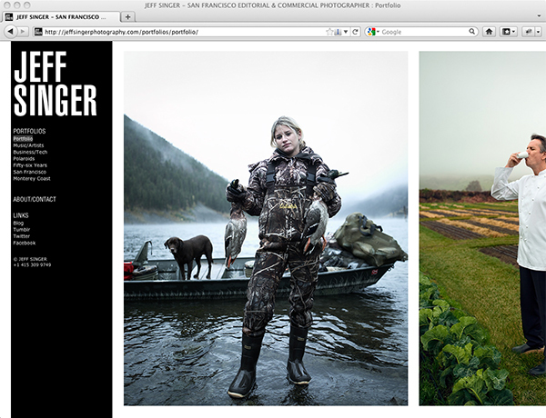
 Today I was supposed to be telling you all about my new identity. No, I'm not going into Wit-Sec. I just had my branding redone. But today's post won't be about my new identity. Last week when my job was scheduled to be printed, the etching machine that does the engraving process being used on my new print pieces broke down (as old-school mechanical things do at times). So today I'm here to tell you about my new website which incorporates the new identity into it. I'll have more on the new identity and the process when the printed pieces are finished.
I actually did the website design and coding myself using Indexhibit. That means for the better part of the last week I've been spending hours and hours learning the in's and out's of HTML and CSS (just how I always wanted to spend my time). I'm pretty happy with what I came up with. But frankly this was supposed to be a temporary solution until I had my designer design a site and have a proper developer code it. It's a little out of my budget at the moment so I thought getting the main logo and print design work done first and using a template site would be a good interim fix (I was going to use Virb, which I'd been using for iPad visitors to my Flash site). But like I said, I actually like the site so I think it may stick around longer than anticipated.
Let me just say I'm not fan of Flash. So I'm very happy to say that my site is now 100% Flash free. I've been with Livebooks for quite a few years and have always been happy with their service. But, they're pretty entrenched in Flash and while I kept hoping they would move away from it, it's apparent that it's not happening any time soon. In fact, they seem to have hunkered down in the Flash camp and just launched their newest service based on Flash. But, if you don't mind a flash site you should check out the new Livebooks Scaler service.
I really wanted a cleaner simple design without all the flash (literally and figuratively). I noticed more and more, the sites I like the most were quick and easy to load without any navigational bells and whistles. Of course, most of my web browsing is done on an iPad these days, so if a site had Flash I would usually just move on unless I was compelled enough to bring it up on a computer . Thinking that more and more people are going to be using iPads (29 million out there to date) I definitely didn't want people to get to my website and move on... or see an inferior mobile version of the site. As it is my new site works great with the iPad and any tablet.
I also updated my blog to match the new identity and website... but you knew that already since you're here.
So here it is, my new site: http://jeffsingerphotography.com
If you see any issues with the site I'd love to hear about it. I've really only tested it on a Mac and iPad/iPhone. I brought it up in Windows XP running in Parallels and some of the fonts rendered somewhat poorly so I'm not sure if that's just a Parallels/Windows issue or if Windows just renders these fonts uglier in general.
I also created a new Tumblr site as well if you want to check that out.
