Ch-Ch-Ch-Ch-Changes
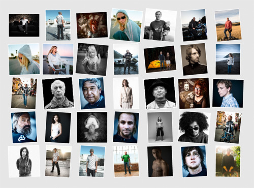
 I'm working on a redesign of my current website. Below is a link to a sample of what would be the gallery "engine" of the website. Currently I use Livebooks to power my website and while it has worked well, I'm getting a little tired of the format (that and it seems like every other photographer's website I go to lately is a Livebooks page with the same basic layout).
So far, I like the new gallery (although I don't know what I'd do with the overall site design just yet). However, I often like things because they are new and different rather than better... I tend to get sick of things and I've had the same web design for a while.
We all know that most photo buyers prefer a simple "show me the damn images" website without being fancy. It's usually the photographers who get off on the elaborate, intricately designed and oh so clever websites that take forever to load and are impossible to navigate but are supposedly "worth the hassle."
Some things I like about the new gallery: - I like being able to see all the images at once in the thumbnail view - I like that the images are a lot larger when viewing full size - I like the interface and prefer its navigation (when using the arrow keys its quicker to go from image to image).
Some things I don't like about the new gallery - It seems to load slower - The images are displayed in random order. This means I can't put the images in the order I want. - The image order changes every time you load the page so if a buyer wants to show another buyer a particular image and say's "I like the 3rd picture on the 2nd row" it means nothing because that image changes location every time the page is loaded.
So, if you'd like, check out the new gallery and let me know what you think or if you have any problems with the page: http://www.jeffsingerphotography.com/testnew/test/
And of course you can see the current design here.
